How to Create Infographics with Long-Term Traffic Potential
Infographics are powerful instruments in content marketing. They look catchy, make the info easy to digest, and are share-worthy. But these visuals can hardly help you in the long run if they drive no organic traffic monthly.
Sure thing, when a new infographic goes live on your blog, your loyal readers will see it. But what’s next? It’ll become just another useless page taking space on your site and bringing little to no value in return. According to the analysis of around a billion pages, 91% of them don’t get any organic traffic. The question is how to keep your infographics among the remaining 9% and welcome new visitors month by month.
Turning an infographic into a steady traffic source requires a strategy. While the visual side matters, you must analyze its potential from a marketing point. Here are the main strategic points to keep in mind when working on a new infographic.
Learn If Your Upcoming Infographics Are in Search Demand
You may have a brilliant topic idea for your infographic but here’s the thing. It has nothing to do with its actual traffic potential. If there’s hardly anyone who googles it, you can’t expect a lot of visitors from Google search. Your visual content must match real users’ queries, or Google will have nothing to rank them for.
Let’s say you want to post an infographic about marketing trends. Go check if this topic matches any queries and how many searches each of them gets, aka their Search Volume.
As shown below, there are over 1K infographic queries that include “marketing” and can reach up to 600 searches per month. That said, it’s definitely a sought-after topic.
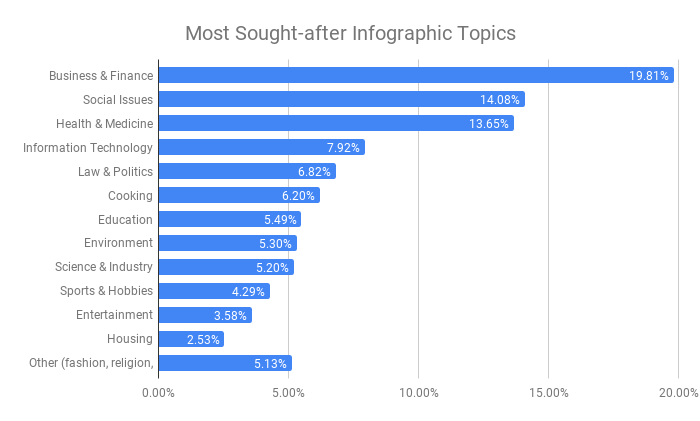
To give you a better idea of topics in demand, I analyzed 2K+ real users’ queries that include “infographics.” The most sought-after queries relate to business and finance (19.81%), followed by social problems (14.08%) and health issues (13.65%). Check out a full breakdown of infographic queries by categories.
Note that you don’t necessarily have to stick to queries including “infographics.” Feel free to choose any other topics that’s in demand among searchers.
Compare Searches to Actual Clicks
The only fact that your topic gets searches isn’t a 100% traffic guarantee. Searches don’t turn into page visits for each and every query.
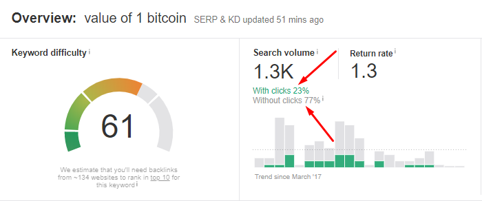
Let’s say you want to create an infographic about a bitcoin value. At first sight, such a topic looks promising. The query “value of 1 bitcoin” gets 1,3K searches per month. But dig deeper, and you’ll see that only 23% of them result in clicks.
It happens because Google displays a currency converter for the query at the top. And it must be enough for 77% of searchers, as they never click through organic results. So, make sure there’s no Knowledge Card for your target query. Otherwise, most users will see an instant answer and finish their search, without visiting your infographic page.
Analyze for How Long Your Infographic Topics Get Searches
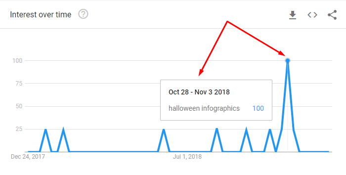
Not all topics get an equal amount of searches and clicks (!) throughout the year. When Halloween is around the corner, people google queries related to this holiday actively. So, you can have a lot of new visitors land on your blog with a Halloween infographic.
But when the holiday is over, the interest in the topic goes down, staying low for the rest of the year. Here’s how the annual search interest in Halloween infographics looks.
Don’t get it wrong. It doesn’t mean you should stop visualizing seasonal topics. Just don’t consider them to be your traffic source all year round. To understand the seasonality of your infographic topics, use Google Trends. Also, watch a video below to understand how you can use this free tool to its full potential.
Find out If Your Infographics Can Withstand Competition
Using infographics for content marketing is as old as time. You’re not the only one to try to get your visuals ranking for juicy queries. A lot of your competitors are doing the same. To choose easy-to-rank queries, estimate their Keyword Difficulty score (KD). For some queries, it’s easy to promote infographics to the top. Others require so much work that the whole thing may not be worth it.
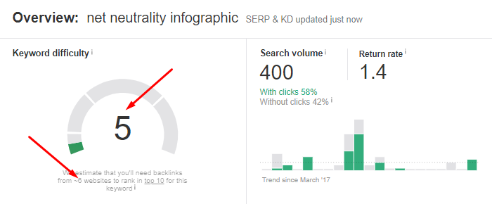
Different tools rely on their own methods to calculate KD. Since backlinks are among the critical ranking factors, this KD algorithm is based on them. For example, a “net neutrality infographic” query has a KD of 5, which means you can promote it to the top 10 with backlinks from 6 websites. Learn more about this way of calculating KD.
Note that 10 backlinks from 10 different sites bring more power than 10 backlinks from the same site. The bottom line is to earn backlinks from different domains to boost your infographic ranking chances.
Add Link Bait to Your Infographics
As mentioned above, your infographics need some link juice to rank high. So, let’s figure out how you can keep them link-worthy.
There’s only one reason why authors link back to someone else’s content of their own free will. It lets them improve their own write-ups without doing a ton of work. It can be anything from adding proof to their statements to sharing more relevant info on the topic. Here’s the data to include as link bait in your infographics:
- niche research stats (here’s a striking example);
- audience survey results;
- case study figures;
- tips and quotes from influencers;
- free items, whether they are totally free or have a free starter plan only.
Get Your Infographics in the Place of Broken Links
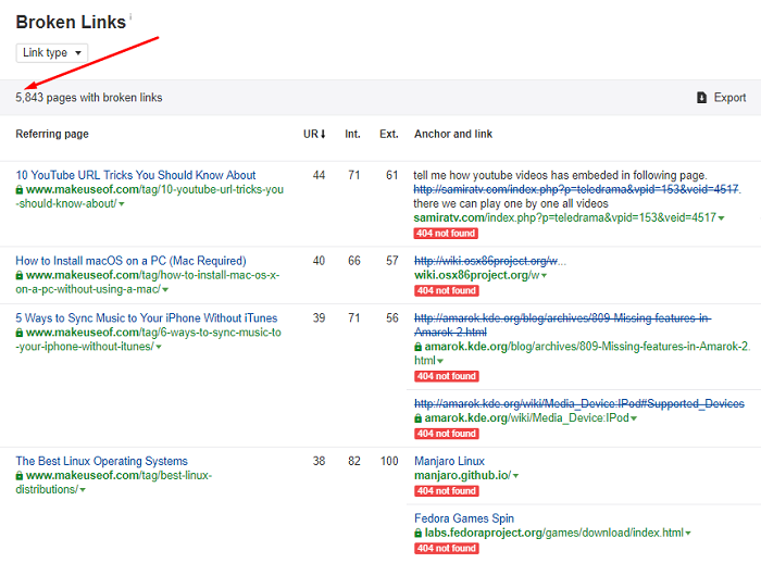
Broken links are constantly showing up on websites for various reasons. Some startup goes broke, so its domain usually goes to trash. Sites that link to expired domains and 404 pages end up with broken links. This is an SEO issue that needs fixing.
Notify site admins about the issue and offer them a quick, relevant fix with your infographic. As they’ll benefit from it too, this outreach excuse is quite reasonable, with higher response rates expected.
As you can see above, one site can have thousands of pages with broken links. And each page can have more than one broken link. So, the playing field is broad, and these tips can improve your outcomes.
- Find multiple broken links for the same topic and submit your infographic to all of those sites. If you create a different piece of content for each broken link, you’ll run out of time way too fast.
- Start with pages that receive monthly organic traffic. That way, you’ll gain some exposure, not just a backlink alone.
Visualize Fruitful Topics of Your Competitors
Competitors aren’t there only to put up roadblocks on your way. Their content can become your source of fruitful infographic topics. Especially since there are many tools giving insights into third-party domains. Competitor research is one of the key SEO strategies for 2019 that you can implement in three steps only.
- Learn what topics bring traffic and links to your competitors.
- Check if Google suggests infographics for such topics.
- Create infographics for the topics that have not been visualized yet.
Wrap-up
No matter how catchy your infographic looks, it’s just the tip of the iceberg. If you want your visuals to pay off in the long run, approach them as a marketer. First, identify easy pickings among users’ search queries. Then, back up your content with a bunch of backlinks, and you’ll come up with infographics with huge traffic potential. Do any other infographic strategies work for you? Let’s discuss them in the comments!

Subscribe to Crackitt's Visual Marketing Workshop
Get exclusive visual marketing lessons and business growth hacks right inside your inbox.


